Thursday, 27 November 2014

Responsive session 3

Project proposals:
Upon accepting a live brief, always read it through and put together a project proposal. In this proposal you set clear aims and objectives that you see fit and possible in the time given, for it to make a fair trade between artist and client.
Things to consider:

  1. Set clear aims and objectives
  2. Be SMART (Specific, Measurable, Achievable, Realistic, Time Conscious)
  3. Use words from the brief
  4. Justify the need for your proposal
  5. Describe your audience
  6. Describe your motivations
  7. Consider the reader
  8. Eliminate vagueness
  9. Visualise the ending
  10. Assume nothing
Brief title: Propercorn
Brief:
Create a piece of communication or campaign that engages the consumer with the product. Get them notified that this isn't just your regular popcorn. Bring the already living product more to life through their designs.
Product:
Popcorn, 5 flavours of it. They are quite distinctive flavours, not very common on the market.
Tone of voice:
Simple designs, colourful (the soft colours with the black and white illustrations), Illustrative, fun.
Audience:
Consumers who love popcorn and who are trend-conscious. Maybe people who love the product and want to invest in the brand as well.
Context:
Commercials for TV/internet (like ads for youtube), popup or sidebar ads for internet pages.
Additional information/considerations
Where to place the deliverables? (animation?) Screen on tv? Place on the internet (A lot of creatives are a lot on the internet.) 
Key area is that they are a lot in-store located, how to incorporate this?
Mandatory Requirements
Faithful to brand
Encouraging awareness
Commercially viable
Propercorn logo is free to incorporate

Deliverables
Illustrations that fit the design
Storyboards
Animation (if the time allows it)

Responsive session 2

  • 5 most important words
  • 5 most important considerations
  • 5 related products
  • 5 related places
Me vs somebody else

5 most important words
Properly  -  'done -properly'
Guilt-free  -  aspirational
Creative  -  20-35
Conscious  -  Culture
Engagement  -  Faithful

5 most important considerations
How to connect with the audience?
20-35 year olds
When is something done properly?
Guilt free, low calorie, high fiber
How to bring the brand to life?
Appeal to women but not driven by this
How to make people aware of the health-conscious product?
Propercorn logo
How to engage costumers with the product?
Stand out
(It seems both of us interpreted this point very differently. I looked more at the questions I can ask myself regarding of what they ask of me in the brief, while the other person listed what the brief literally says that should be taken in account.)

5 related products
Protein bars  -  Butterkiss
Other snacks like crisps  -  Graze boxes
Bowls (for presentation)  -  Healthy snacks (Holland&Barrett)
Candyfloss  -  Alpro soya
Corn!  -  Free range products

5 related places
Cinema  -  Whole food outlets
Grocery store  -  Super markets
Own home  -  Cinemas
Fair/carnaval/attraction park  -  WH Smith/book shops that sell snacks
Festival  -  Cafes (potentially)


Through this assignment I was able to see how different people can interpret a brief. I think there is no right or wrong way to doing this, for the goal is to keep asking questions to investigate it even further. This is what I hope to do through answering the next questions from the form/questionnaire.

The problems I aim to solve are:

The unawareness of the product. Since the product is fairly new, it's not known very well yet among the general consumers. 
If there are any other places and spaces that can contribute to a better distribution of the product.
If there's anything else that could be improved by the "done properly" ethos, how to bring a brand to life when it's first of its kind.

In order to solve these problems I will:

I will try to create some form of advertisement that will grasp the attention of the people.
I will look into branches of shops that support the "done properly" ethos, so stores that pay attention to whole foods and products for a better wellbeing (ie fairtrade).
I will try and look intro different products and if there's a way possible to make it fit the "done properly" ethos.

I will be aiming to communicate (identify three specific messages, ideas, moods etc):

That it's not just a standard packet of popcorn. It has some interesting flavour combinations that you wouldn't expect in popcorn. It's also supposed to be fun, hence the "guilt-free". You want to enjoy your popcorn (ha! Enjoy, see: is fun) without feeling any consequences. This is also a popcorn that's easy to go, it's is available in small packaging as well big sharing sized packs. 

To an audience of: (Name three characteristics)

Lovers of popcorn, trend-conscious, people who also want to invest in an upcoming brand

About LoopdeLoop

LoopdeLoop is a bimonthly animation challenge. Animators all over the world are invited to create an animation following the set theme for the two months. It started as a monthly challenge, but over time the themes were stretched out over two months. Probably to provide artists with more time to produce their animations.

It started with the Animation Club's Secret Handshake event. These screenings were a monthly animation night organised by Sarah Phillips and hosted by James Hazelden. It was for both professional and students an opportunity to experiment with skills and to show their skills in front of a live audience.

LoopdeLoop was the follow-up of Secret Handshake, providing opportunities to not only create short animations to a set theme, but to network internationally through their blog as well. LoopdeLoop hopes to connect independent animators this way.
Instead of creating a complete animation which can turn out into great projects, they opted to show short animated loops instead. The reason is to make creative work for these projects more fun and achievable. Because it's not a big project it's also less intimidating because there's no need for a full animated narrative.
Now I am not saying these loops are easy as cake to make. Of course it's still a challenge to create an animated loop, because you are forced to put your idea into a tiny shell and put a lot of effort into making the short sequence. When executed well, you are left with a loop that consists of an engaging sequence, flowing nicely and inviting to be watched over and over again.

The entries to the contest are uploaded continuously to the blog, so the site is full of new content every time to vote for. Upon reaching the deadline, the committee will choose a few finalists based on their quality and popularity on the blog. The audience attending the screening can choose a winner from these chosen loops. Winners and followups are featured on the website until the next deadline and receive a price.


At the end of September LoopdeLoop set up a funding event on indiegogo.com to keep it all free. Since LoopdeLoop is a growing concept, more people are getting involved to keep it all alive and kicking. Money is needed for the screenings, legal inquiries and other things like website hosting.


The theme mostly consist of one word or concept, leaving plenty of room for own interpretation. Since the theme is so general, All kinds of animations are possible, as long as it's connected to the theme in some way or sense.


Tuesday, 25 November 2014

Contacting Studios and Showreel!


This week I made the first step into contacting some studios for an internship. For this I created my first showreel (as shown above). I created a draft version and showed this to Annabeth first for some feedback. With some lovely critique on how to improve the showreel I left some stuff out, put something extra in, and tried to shorten it a bit for it might've been a tad bit too long the first time round. 

I wanted to contact some studios already to ask for some information if they have places for interns or not and if they further require anything from their applicants. I wanted to contact them already because it's never a bad thing to try and get your name known in the animation world. My teachers in the Netherlands told me a lot of studios are likely to prefer you call them instead of sending e-mails, but calling overseas is a bit too expensive for me right now, so I try to stick to e-mails instead for the time being.

I hope I receive some replies soon, but for now it's just wait.

Responsive Brief 1: LoopdeLoop

I participated in this competition before I really had any of the responsive sessions (except for the very first one which was an introduction) so taken this in account it explains I didn't answer any of the questions which were introduced the next sessions.

Let's start off with shortly explaining what LoopdeLoop is:

"Another thing that freaks me out is time. Time is like a book. You have a beginning, a middle and an end. It's just a cycle." 
Mike Tyson
Simply said: LoopdeLoop is an animation challenge. Bimonthly a theme is set and the goal is to create a short animation in the form of film or GIF to submit to the website. The last week of said two months the collection is screened at different locations to a live audience. At each screening location a winner is declared who will be shown on the website during the next competition.


The theme for October/November was Go!
I started off with small spider diagram to brainstorm along with, writing down the first things I thought about hearing the word "go"
Since the submissions are posted to the site while the competition is running, so I could already look at a few of them. At that moment there were some loops about running and competitions, therefore I didn't want to create something in the same genre for my loop probably won't stand out like that. Eventually I went with the "go fetch!" for I already had a few ideas on what I could create.

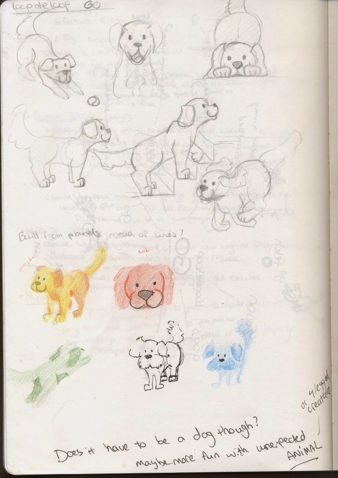
I started with some designs on the dog:


After the first page of sketches I thought: maybe not create another creature to fetch the ball? Might be funny and unexpected. I let the idea rest for a few days before deciding on the dog anyways.
After the designs I decided on what I wanted for the background. For I wanted to animate the dog the traditional way (pencil and paper) I wanted to paint the background. I searched on Google for images of parks that fit my idea what I had in mind a sketched a few of those before deciding which one to paint.


I then started sketching the keyframes on animation paper. Content with what I had in mind, I went ahead and drew all the inbetweens with pencil as well. Even though it wasn't a clever move: I started animating without any plan written down, any storyboard sketched beforehand, so I was basically animating into nothing. Even though there's nothing much happening, I wasn't pleased with how lost it felt, not knowing what exactly I wanted to animate. After finishing the sketches (turned out to be around 90 frames in total) I flipped through it before finelining all the frames. I thought the timing looked fine and went ahead to draw all the frames with a fineliner as final frames. I then also found out I missed a frame while sketching! Ohhhhh! Fixed that along the way.

After finishing all the frames it was time to scan them all to the computer, took me a while. Longer than I anticipated so that was a bit of downer. 


When I finished scanning all the images I had to manipulate all the images manually one by one in photoshop for I had to get rid of the white background, but keep the dog itself white. (Since I didn't give the dog a certain colour, I couldn't simply key the white out of the images in After Effects.) I loaded the images ten by ten into photoshop to prevent the application from crashing, then changed the levels of said images to make the black lines crisper and the white background whiter. Using masks I deleted the white background and then saved them as IFF-files.


I then loaded the IFF files as image sequences into after Effects, "shot by shot" so I could use some frames on repeat and to alter the speed of some frames if I needed to without messing up all the sequences. After the dog was successfully placed in front of the background I painted earlier, I exported the file to Premiere Pro to add the sounds. I went for a simple background track of park-y sounds of whispering birds and added the whistle and the panting and running of the dog on top of that. 


I enjoyed spending a little of my time working on this little project. The reason I created it using traditional methods is because I wanted to try animating on paper (for I've only done 2D animation on the computer before) so I wanted to experience of animating on paper, not being able to check every to seconds if it's correct to the point. So a bit of guessing, a bit of playing and a bit of knowledge I already have from before. I thought it went reasonably well. I didn't have to add in extra frames afterwards for I felt the timing was quite alright. I also thought the style would fit the free, loose, fun style of LoopdeLoop.


Sunday, 23 November 2014

Responsive session 2 - important questions to ask yourself.

When reading into a brief to look if it's a brief worth putting your time and effort into, it's useful to ask yourself these questions:

Regarding session 1:
  • What problem(s) are identified by the brief 
  • What is the brief asking you to do about it/them?
  • What is the brief trying to achieve?
  • Who will benefit?
  • What is the message?
  • Who is the audience?
  • How will the message be delivered?
  • Can you foresee any problems in responding to the brief?

Regarding session 2:
  • Who is the audience?
  • Who should the audience be?
  • Who could the audience be? (alternative potential)
  • Why ar they your audience? Why is it appropriate?
  • What does this audience do?
  • Where do they go?
  • What do they buy?
  • What do they want to be? (Important! apparently)
While reading the brief, look for these points to identify the brief better:
  • 5 most important words
  • 5 most important considerations
  • 5 related products
  • 5 related places
Further things to ask yourself:
  • I intend to produce...
  • The content will focus on: (themes, texts, concepts)
  • I will be aiming to communicate (specific messages, ideas, moods)
  • To an audience (characteristics) 
  • The problems I aim to solve are:
  • In order to solve these problems I will:
  • I will be aiming to communicate (identify three specific messages, ideas, moods etc):
  • To an audience of: (Name three characteristics)

Friday, 21 November 2014

BAF10 - Strange Hill High

Strange Hill High is an animated TVseries for cbbc.
The first one to talk was Mark Oswin.

Mark Oswin is one of the screenwriters for Strange Hill High. SHH is a collection of sci fi short stories in a city school with three main characters with different personalities that complement each other. Oswin illustrated this description of "sci fi short stories" as Twilight zone in a high school".

He first talked about the development:
  • One line pitches
  • Writers room
  • 1 page outline
  • SXS
  • 1st draft script
  • Redrafts
  • Polish
They start the production of an episode by thinking of funny oneliners that can lead into an idea for a full episode. After choosing a oneliner they see fit, the gather round in the writers room, to discuss it and develop the storyline that fits the oneliner. Then they create the one page outline which is a description of how the episode is going to develop. Next is scene by scene writing where the episode gets written down in full detail, next is the first draft script, redrafts and finally polishing up the script, ready for recording.

Creating this series they use a three act structure (actually, it's more like 4, but whatever)
Act 1:
- Set up
- Inciting incident
Act 2 (I):
- Playing with fire
- Midpoint
Act 2 (II):
- Down Hill
- Lowest Point
Act 3:
- Fight back and fail
- Out of the bag

This all seemed pretty clear to me. It's a familiar style of creating stories, especially for children. It's one of the structures which have been discussed in a script writing workshop I attended last year in the Netherlands. He illustrated and explained the 3-act structure using an existing episode as an example.

Tips for writing:
- Write what makes you laugh. (Use sophisticated humour though for kids shows. This is actually quite a good thing because you can't fall back on jokes based on sex, violence or swearing)
- Plot/comedy/character balance is important
- Big visual comedy is necessary for TV
- No text! Gags and jokes based on text don't translate well. 
- Movie moments

Also. Don't patronise kids. They'll know.


Second to Talk was tim Jones, he is the lead puppeteer for the show. (Of which the puppets are visualised by Ian Mackinnon) They use two puppeteers for each puppet, one to control the main body and the head and one to control the hands. They animate live to storyboards and the recordings made before and they "animate in reverse". (I noted this down but I don't really remember what he meant by that, Danique, bad notes!)

The controls for the puppets consist of three rods. One main rod that basically goes up his bum. Like a muppet! This rod has flicky thingy controls for moving the head like turning it around. The other two rods are connected to the hands with hinges in the wrist, so they twist nicely around when moving the rod.
Because they need two puppeteers per puppet, when they shoot the main scenes, it's quite crowded beneath the set, for there are six people standing really close together, trying to get everything done.
For the animation of the mouth they use 3D animation and through compositing it's placed over the heads of the puppets. A lovely detail to the puppets is that the costumes aren't just really tiny, everything is small to scale. Tiny stitches were used to make the details look gorgeous and to make it feel and look natural.


I enjoyed the talk itself for they both were short and to the point. They both managed to keep my attention the whole time, for I dozed off a bit during the discussion and Q&A. I felt it was all a bit too  long and a lot got repeated as well. I might look this series up one time. I'm really interested in it now for I think it might be my humour!


BAF9 - The Boxtrolls - behind the scenes with Mark Shapiro

Below I'll post my notes from this talk of Mark Shapiro.

Mark Shapiro works at Laika studios, which already created 3 well known feature films to date, Coraline (2009), Paranorman (2012) and the Boxtrolls (2014).

Mark works in the marketing department of the studio. Laika always uses a bit of behind the scenes footage when promoting a new film. This footage is part of a marketing, one might say. In the teaser for the Boxtrolls they specifically kept mentioning that the film is created by hand, with puppets, and everything is stop motion. To illustrate this the behind the scenes footage was used.

Lead characters in the film each had about 30 puppets. This way they could shoot scenes simultaneously and use different puppets for costume changes. Different puppets of the same character were also made to serve different purposes. For example: the Boxtrolls all wear a box and enter them sometimes, but the puppets are too big and complex to fit into the box. For these scenes they created different puppets of the troll with only limbs, so they could mimic the troll going into his box.


There are around 400 workers in the team, 10 of which are animators, the rest consists of all other kinds of departments, like puppet designers, hair department, clothing department, etc. Even though they promote to have created everything by hand (which is true for the most part), because this film asks for lots of crowds, most part of those crowds are composited on the computer. Sometimes painted backgrounds were used as well. Seam and rig removal was also done digitally. (the seams on the faces and the animation rigs)

Everything is asymmetrical in design, there is no straight line, it's all at an angle.

This film was a tall production, it asked for many tall sets and many, many props. In the film they used both replacement faces as well as mechanical faces. Faces are printed from special 3D colour printers, this gave a theatrical look to the puppets in this production, as opposed to Paranorman (other kind of 3D colour printer) and Coraline (Black and white printed and hand painted.) Mechanical faces were used for characters that didn't have much screentime, or didn't require much animation in the face (for they had no lines for example).

The film was shot what Canon 5D cameras, using natural lights and shadows in outdoor scenes and practical light in dark indoor scenes. It was shot 24 frames per second with 2 cameras at the same time to produce it in 3D as well. Animatable hair, as well as clothing contains wires. Hair that was not to be animated were printed solid. If it had to move for some reason (for example pulling on a moustache), they printed multiple of the face with the changing moustache, just like normal replacement faces.

A lot of different people from all the departments came from interesting backgrounds that didn't necessarily had to do with film production and animation. The ladies from hair department had a background in jewellery, set designers/producers had a theater background, etc. A lot of the departments work at the same scenes at the same time: for example puppet, prop, green, hair and clothing. (probably some more but he didn't tell, grrrr)

The mecha/megadrill was the biggest puppet they have worked with. It was a tad bit shorter than a grown man. The fire in the drill was an app on an ipad they had placed in the grill, instead of printed fire like in Coraline. Another hard part to animate (besides fire) was water: There's a scene where Eggs is in the sewers. They animated the water in the sewers by using a glass shower door with texture and placing movable lights beneath it. Moving the lights while filming made it look like the water was moving instead.

What is important during the creation of a puppet film is that a stable temperature is required. The temperature has an influence on the puppets and props (expansion/shrinking). Further the character designs and storyboard took 4 years to create.


Every now and then he showed a film as well of the behind the scenes footage, and the BTS footage they used to promote with. After this there was time for questions, and I felt I should try and speak up for once (heart thumping in my throat, afraid to fuck up.) I've always been curious how big productions like these managed to contain an universal style throughout the film, for when we created a stop motion short last year, there was a visible difference (at least to us) between different shots that were animated by either me, or two of my other group mates (we were a group of four, one was the "director" doing everything behind the camera, and us three were animating). So my question was "how do all the animators get on the same line to create the same style of animation throughout the film, for there are quite the few animators and everybody of course has his/her own style. How do you achieve the universal style?" In which he replied (in short) that a lot of the animators have been working since the start of Laika, so they've been working together for more productions already. Production is slow, so through the years the animators developed a common style. Directors also point out characters to certain animators because their distinctive style fits the character.

I really loved the talk, It's always really nice to take a look behind the scenes. I often watch lots of old behind the scenes footages from films to get me motivated, so a detailed talk like this was certainly something. (Even though I have no wishes now to create stop motion films, I really like the process.)

BAF8 - Fantoche presents: Girls on the run

At first I didn't really know what to expect for I didn't really read the booklet before hand, but when Nobuaki Doi (Japanese screenwriter, programmer, researcher and critic on animation) introduced the screening with his informative talk, I was really looking forward to spot the difference and if I was able to tell the differences.

He put this screening together for Switzerland before to show the difference between animations created by male and female animators. Especially to show the difference between drawn women by both genders. A lot of women choose to portray a "real life" girl instead of idolised images of girls in real life. These idolised images of girls set a high bar for fan boys of the communities. The change of image of girls in animation is a big, positive thing, trying to put a bit more education into the animations. The animations are to be divided into two parts, those created by men which mostly portray desire, and those created by women which are more psychological, more in the head you might say.

I think for this post I want to talk about a few that stood out to me.

Transfer Fantasista - Utamaro, Kazuma Ikeda


I'll start of with the first one! It started off like a generic (man designed) anime sequence. A girl wakes up (too late probably), gets dressed, gets her breakfast and runs out of the house in the direction of which is probably school. (Knickers-shot tally is already to be counted on two hands by now). At some point I felt it was going somewhere else than I expected it to go because of an inhumane jump, the girl then falling down but still managing to land "normally" and continue her journey. Turned out the sequence kept on repeating but every time with different backgrounds, environments, settings and art styles. The music was a bit indie techno and I thought it was pretty decent. I must say I kind of liked this one (I think because of the music), except for the over excessive panty-shots. (but I also guess that's kind of the point? Easily spotting the difference this way.)

Yamasuki Yamazaki - Shishi Yamazaki


I really loved this one even though it might seem weird at some moments. I really loved the vibrant pink, blue and red used in this video. The description used by the animator is as follows: "When you're insanely happy, you're so happy to be happy, that you forget what made you happy". I think that really shows through the video, there's a lot of dancing, happily moving around and having fun in the video. I really love all the transitions though morph in the short, it adds that bit of weird to it. The song really adds to the visuals, it makes me feel happy, so I think that's a job well done for Shishi Yamazaki. The video flows with femininity and joy, I think it's really lovely.


Tuesday, 18 November 2014

BAF7 - Meet the speakers: Peter Lord, Ian Mackinnon, Mark Shaprio

After the talk of Peter Lord they planned a little session of meet the speakers. The speakers present were Peter Lord and Ian Mackinnon at first, Mark Shapiro joined us later (probably a huge jetlag, we understand Mark, we understand.)

It started off with Paul Wells starting a conversation between him and the speakers, addressing different frequently asked questions about the animation world for stop motion animators nowadays. After the little talking session they opened themselves up for questions from the audience. This time on a smaller scale, which made it all nice and homey.

Upon the question on how to stand out in such a fierce community that is the world of animation they gave some pretty solid advice:

Find a bit that you're very good at and excel in it. Allrounded animators are hard to find because there aren't many. Studios rather have animators who are professionalised in that what they enjoy most doing. "Leech" off other people's skills since you are a collaborator in this world, start collaboration as soon as you can.
Specialism -> Evidence in show.

There are three types of skills important in this world:
Specialist skills. Specialise in that what you enjoy doing to stand out from the crowd.
Generalist skills. It's always good to have some general skills as a trump card.
Transferable skills. This world is all about networking and communication.

It all comes down to three keywords:
Collaboration
Innovation
Creativity


I really liked attending this talk on such a small scale because you feel more involved to the conversation (without even speaking though, still.) They were genuine and nice people and open to any kind of conversation and open to a lot of questions. When we got some free playtime to talk one on one with them, perhaps ask for autographs or photographs, they didn't back down from any question and it felt to me they were truly honest.


BAF6 - Peter Lord, Aardman Studios


During this Artist Talk Peter discusses the beginning of Aardman studios to what it is right now.
All that while creating a replica of their key character Morph. Well played Peter, well played.

(What follows now are in short my notes I made during the talk)

Aardman, what doest it mean? Nothing much really. In the beginning there were Dave and Peter around 17 years old. Dave's father fixed them a job: to create something for deaf children for the BBC. After finishing the short (containing Superman) the BBC was content and some guy whose name they didn't know wanted to write a cheque. They called him the aardman, for they thought aardvarks were funny animals with a fun name and the short had superman in it. Aard + man.

Because they were both bad drawers they went into the third dimension: using plasticine and modelling clay. They started creating stop motion shorts with 3D creations. in 1976 they created the character Morph, filmed blindly on 16mm film. Morph did well, they could stay.

Then they got a suggestion: animate to a soundtrack. From this they started something he liked to call "eavesdropping on conversations" and animate those conversations. The conversations turned out pretty lame and the got fed up so they decided to interview people and animate zoo animals to those interviews. (1989)

Before they started to create feature films in the 00's they made many shorts and made their way until where they are now.

The studio nowadays consists of 5 departments
  • Feature films
  • TV commercials
  • TV series
  • Digital team (Apps/website)
  • Writing
"Pixar is dull. Just a bunch of guys on computers. Aardman is a playground" © Peter Lord.

I really enjoyed this talk and listening to Peter talking. He had a feeling of trailing off a lot and I thought that made it all feel really genuine. It felt human and personal. There was also a possibility to ask him questions and some really nice ones came forward. I never know what to ask speakers on such a big scale. Hell, I don't even know what to ask them if I meet them face to face. I should start preparing myself better.


BAF5 - Films for Children

I'm going to label these together because I'm not sure what I can say about all these shorts. I must say, I found a lot of these adorable (Balloon Birds, Pik Pik Pik, The Elephant And The Bicycle and Goodnight Rainbow) and Nain Géant was plain gorgeous to me.

What came forward the most to me was that the most is that even though animations for children mostly want to tell a story, that doesn't mean the art style has to suffer for it. A few were actually so clever to me, that they surpassed the level "for children" and could be shown as regular shorts as well for the story was really generic, not kiddie based to my liking.


BALLOON BIRDS - trailer from Marjolaine on Vimeo.

Balloon Birds, directed by Marjolaine Perreten, was really sweet. It was really short and had these two tiny birds as main characters. It was a cheeky film about two birds having fun with each other. The style is really simple and the sounds were really high pitched which gave it a huge cute-factor. It was pretty darn cute to be honest. Doesn't matter. Still loved it.

The other one I want to talk about is The Elephant And The Bicycle, directed by Olesya Schukina.
The story is about an elephant which cleans the city from its rubbish for a little bit of money in return. It's a regular thing he does everyday and afterwards he buys himself bananas for a treat. One day he sees an advert for a bicycle. It's so pretty, he dreams of it and he really wants one. So he starts to save his money. He's working extra hard, extra hours, all to get the money together for the bicycle with big hopes in mind. The reality turned pretty sour. The bike was really tiny, while the elephant was humongous. Sad that his hard work didn't pay off he stays inside upset in his house for days until the people living around him start complaining that the streets aren't clean. The elephant leaves the house, puts the bike in a bag and starts walking around the city, finding a small girl worthy of the bicycle. Making her happy his spirits lift up and starts his usual routine of cleaning the city again.
The short was really funny and cute, the story was simple and it was mostly the choice of style that made it appeal to children to me. I think with another choice of style this short could work easily as a regular short as well.


Nain Géant, directed by Fabienne Giezendanner was plain lovely. I really love their style for the animation. "According to tradition, Petite Neige, a young inuit, needs to capture a low flying bird in order to pass into the world of grown-ups. On the verge of catching it, she falls into a mysterious crevice belonging to the giant dwarves, an ogre with the power to change his size at will by sneezing. An initiatory tale for grown ups and little ones." The story and artwork was really gorgeous and they conveyed their message pretty well

Monday, 17 November 2014

BAF4 - Bigeety


To finish this series of shorts I wanted to show my love for this short, Bigeety, directed by Maurice Huvelin.

The style of animation reminded me of animations one of my teachers showed us last year but I can't figure out who made them, it frustrates me so much! (humans are displayed in tiny rectangles consisting of a few colours to distinguish the head from the body and such. one of the shorts I remember has a swimming pool with a diving board as a setting, any ideas?)

I really loved this simplistic style of animation, where the sound really plays an important part, as well as the visual language, for there is not much to look at. There's this Don-like kind of figure as the main who receives a phone call, but the phone is at the far other side and to reach it he has to face many dangers. Of course he doesn't do it himself and there's this sheriff figure helping him out, crossing the lake, defeating the crocodile, climbing past the tree and dinosaur. Only to find out the call has been disconnected. Sudden Tintin appears, and a while later Elliot? I thought it was really clever and funny to be honest.

I need to look up more of these kind of animations because they really know how to play with composition and visual language, because there is not much to play with and they still get the message/story across. A lot of people (including myself) tend to overlook the simplicity of animation and what it can do, so we are more likely to overdo everything and it's really just one big of a mess.

So, any recommendations?

BAF3 - Pommes Frites


I promised myself that I wasn't going to talk about this one, but because it still stands out so much for me, I couldn't leave it behind. Pommes Frites is a Dutch short directed by Balder Westein with voices of popular Dutch comedian Jochem Myjer.

I have really good memories of this one even though it's plain ridiculous and funny. The first time watching this short we were in Stuttgart attending the Trick Film Festival. My classmates and I were sitting at the back and our teachers somewhere in the front. Realising after a few seconds that it was Dutch what we where hearing, (I didn't think it at first, it didn't sound like Dutch, I got put off because of the subtitles at that time) our class got into a major laughing fit. It was quite shameful to be honest, it was so ridiculous. After the series of shorts had finished we were joking around with our teachers, who already were having a feeling it was us laughing so hysterically. (it sounded so familiar).

Aside from the great memories, I sincerely think the short is clever and cheeky. I love the combination of the stop motion puppets with the 3D animation for the mouth (I was actually thinking they used real life footage of Jochem's mouth for this, but maybe a 3D model instead?) I only noticed this after I saw the short a second time (which was past week, coincidentally.) I must say I was quite shocked the first time that they made a KKK reference. It's really a hit or miss kind of joke to make, but I think the credits scene is that what saves their asses from offended people because it makes it visible that the victim knows it was a pure accident. I have the worst kind of humour and find a lot of nonsense ridiculously funny, but I know this is a sensitive subject, so I'm really glad the short was received so well.

BAF2 - Argument

The second short I thoroughly enjoyed was Argument, created by Alexander Ilyash.

"People often make arguments out of nothing. Even though the cause of a quarrel is already forgotten they can keep being angry at each other and make up new reasons for another row, and the situation may never end."

It's basically a woman and a man standing on either side of a cliff arguing with each other, continuously yelling "я" (pronounced "ya", translation: "I"). 
At first the quarrel has an angry vibe to it, continuously trying to diss the other by counter acting the 
arguments, getting to a rather playful side to the argument. Continuously a dove finds a reason to fly 
majestically over the arguing duo, having nothing to do with it. Until he starts stealing the "я". 
From that moment in time it seems the duo starts to work together again, having fun while at it.
Eventually the empty space between the cliffs is filled with letters, forming a sort of water, quicksand-like 
substance for when the man falls in it after chasing the dove away, he seems not to be able to get out.
The woman, trying to help him, falls into it as well and because of the weight, a crack forms beneath them,
breaking open and creating new cliffs. At that point we're back where we started, basically.

I enjoyed the short because of the choice of style in combination with the humour. I thought the event was a pretty recognisable sight. The familiarity made it funny for me. Of course it's not just a simple animation with no meaning to it. In real life, when arguing, people fail to see it from the other person's point of view and the exact same thing is happening here. The characters and stubborn, refusing to listen to each other by breaking it down before it reaches each other. The "majestic dove" obviously refers to peace, but the couple is too stubborn to listen to it. Even though when two doves fly over at the end it really feels like an "in your face" to me.

Even though the style or "quality" of the animation isn't that spectacular (when is quality spectacular though?) I really enjoyed it because of its simplicity. Too much detail and hassle would've put off the message too much and it would just be "a nice short to look at" with no depth whatsoever.

BAF1 - Mute

I already talked about Job, Joris & Marieke last week, but upon seeing Mute for the nth time I feel like I need to talk more about it.


MUTE from Job, Joris & Marieke on Vimeo.

I was quite surprised honestly to see that this short was still in festival regulation. After seeing it for the first time at Playgrounds in 2013 and seeing it winning an award for the best independent film, I was really proud of them. I wasn't that surprised because the short was actually really clever. I remember I was a bit out of it during Playgrounds last year because a lot of things were happening at the same time at school but also in my personal situation. I've also seen the short in Utrecht, at Holland Animation Film Festival. So I was actually quite surprised to see the short still in festival regulations since the full version is available on their website. (What is the usual time a production plays at festivals, though?)

The plot for this short is quite clever and a really good choice to start off the festival. It's light, a bit gruesome, but mostly funny because of the simple shapes used for characters and pastel tone colours in combination with the "gore-y" actions happening in the film. I guess you're not really sure what to expect in the beginning, I heard some distant and muffled (questioning) chuckles in the beginning which bursted into big laughing fits throughout the rest of the film after the plot made its twist. (Which I'm really glad for. JJ&M, if you're reading this: another great response, well done!)

After the series of short shorts was finished I have been eavesdropping a bit on lots of conversations, happy to hear Mute belonged in the top 3 to a lot of people. I must say, I'm a bit biased here, mostly because I already know the short and really love it, but a lot of these shorts weren't my cup of tea, so some Dutch pride really does it for me.

Sunday, 16 November 2014

Modelling and rigging, didn't really go how I expected it go

I first started modelling the head, starting off a similar manner as I created the last head I made for practice. This went fairly well. Because I followed some step by step videos on youtube I encountered little problems technical wise. I had some trouble creating the face exactly like I wanted it to, but when I created the body I still kept tweaking because when the head had a body beneath it I could see the proportions a bit better and realised I wanted the jaw a bit wider for it was a tad too slim to my liking.


I opened up a new file, imported the head and some reference panels and starting creating the body. I made it limb from limb, attaching it to the torso afterwards before merging the head to it. Every time I looked at it, something seemed a bit off but I couldn't put my finer on it so I good friend of mine offered to help me out through facebook. She has a good eye and a really good sense for proportions so with drawing over my original reference and screenshots she was able to help me out with this problem. I didn't really feel like creating shoes (ugh, lazy me) I imported an old character of mine, cut off its legs and altered the mesh a bit to make it fit better with this body and tahdah, shoes!


Then the next part: creating the skeleton. That wasn't all that hard luckily. Remembered it from last time what to do and what not to do, so that went fairly easily. I altered some stuff in the skeleton in the end because Mat is clever and was like: reverse foot is rubbish, here look at my skills. This is better. And HALLELUJAH I should never forget this because this is knowledge you'll need for life! When I wanted to bind the mesh to the skeleton I had a teeny tiny problem though.


This motherfucker.


This week wasn't really my week when it came to rigging the character. A lot of things that possibly could go wrong, all went miserably wrong. First the problem up here. I remember making a few mistakes creating the body but I really thought I deleted all the faulty faces and double vertices and such, turned out I was wrong. After three days of tweaking and cursing Mat came with the solution (I'm eternally grateful) Then I spent the rest of the friday painting the weights, which came it looking pretty okay I think.

Saturday I started on creating the controls for all the limbs and stuff. All fine and dandy, that went pretty good, until I encountered a little problem with the hand. 


That hierarchy though. And I'm not even there yet!
I think I must've mixed up various techniques on rigging the arms/hand because suddenly it started to look messed up. Clean rotation along the axes went okay, but when making a random rotation the hand was like ZAPOWWW. And I couldn't find the problem. I must add, my brain was probably pretty fried at this point because I kept making the SkinCluster disappear. over. and. over. again. I kept losing minutes and minutes of work because I then realised the bind was gone.

Oh well, back to the hand. I mailed Mat for some advice and he came up with a solutions (Danique what's that stupid control doing there? Get rid of it for it's causing the problem.) Great. All the work in creating attributes to the hand such as rolling up to a fist and such gone, but I couldn't be bothered to create them again in fear I would mess up again.


I fixed the problem this sunday, for Mat was really nice and helping me out on his free sunday (you're a saint, Mat) and AGAIN I kept losing the skincluster. AGAIN hours of work wasted. (get your shit together, Danique.) So after a little bit of crying and self loathing I just thought: just add a bit of colour to make it look more appealing and start creating the blendshapes the next week so I can hopefully start animating next weekend after BAF is over. I didn't bother much with uvmaps, except for the eyes and the shoes, and I probably have to unwrap the body though (I already did the head when modelling that, so yay me. For that's the most important part for the UVwrap since I want to try and at a bit of detail in the face if possible, the rest isn't that important in this model)


Now let's hope next week Maya will have a bit of mercy on me. It didn't crash though this weekend, does Mike perhaps have magic fingers? (knocks on wood) EDIT 20 november, I have cursed myself! But I do think do it's because of the image I wanted to load into the project, so maybe it was too much to ask. After I just stopped trying it went alright again.