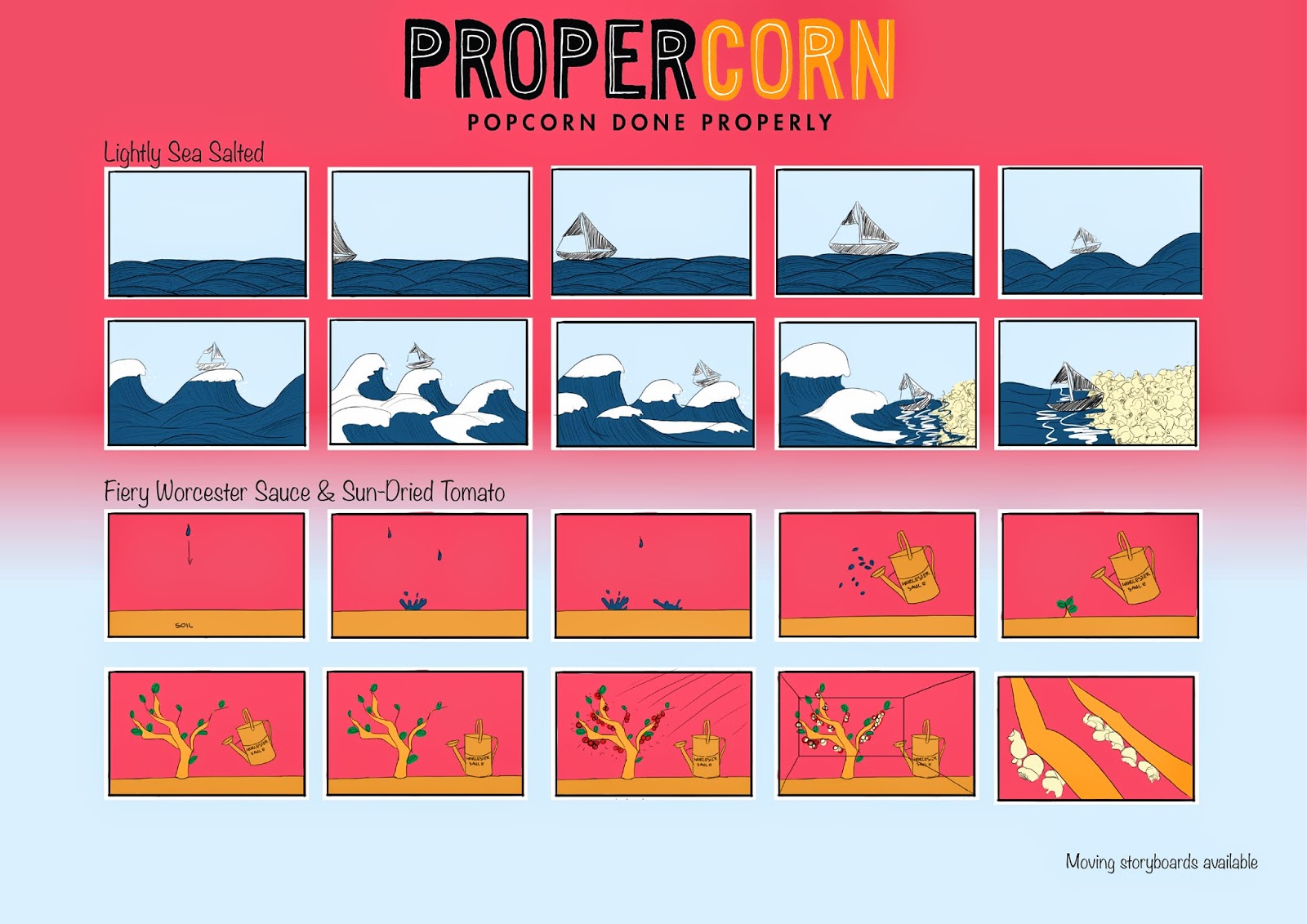
For the last session of Responsive regarding the Propercorn brief, I took some of the feedback in account and tried to create updated versions of the storyboards with colour, decided to turn them into moving storyboards, and create one animatic to (hopefully) make more sense.
I tried to add a bit more life to my presentation boards by adding some simple colour schemes to the background. Intentionally, I didn't add any text to the boards, since I had in mind to never use text on presentation boards for some reason. I did forget though, that these boards should be understandable for anyone, so also for people who don't know what the hell you are doing, so I should've added an extra board explaining the brief and explaining more what I did.
For peer feedback I received the following:
Effectiveness of the proposed concept/response
Strengths:
- It answers the brief
- Looks ar four different flavours
- "Done Properly" ethos has been wel presented
Suggestions:
- Could have more of an explanation on boards: who is the audience, what the brief is, etc.
- Needs more clarity.
To what extent the proposed response solves the identified problem
Strengths:
- It does solve the problem
- Has mock-up so is clear what the endproduct will look like.
- Amazing concept of animating the flavours
- Focuses on calorie content and natural ingredients
Suggestions:
- Where is the contextual research?
How appropriate is the response to the identified audience/context
Strengths:
- Quirky design, appropriate for the audience
- Numerous popcorn lovers, suitable for all ages
- Doesn't judge or stereotype, but fits the entire breadth of target audience.
Suggestions:
- Where other than websites will the advert go?
- Are there any stills of the work for posters?
Comments on visual quality in relation to response
Strengths:
- Keeps with the same design as pack, clearly thought about colour scheme.
- Strong consistent colour scheme with packaging.
Suggestions:
-Keep hand drawn 'rough' charming aesthetic, don't refine digitally too much. (note: wasn't my intention, but mostly lack of time to draw EVERY LINE for four storyboards, whelp.)
- Just to clarify, after the calorie content, add the logo (I knew I forgot something.)
- Specify the medium of the drawings, needs a still of final look as well as the roughs
- background of board distracts from content, better to leave it plain.
Comment on the presentation of the work with regards to the quantity, quality and appropriateness of text based and visual information
Strengths:
- Neatly composed, clear layout
- keeps with relevant, appropriate colour scheme
Suggestions:
- Use a clear background, do not lose focus of content
- More boards with analysed imagery
- Written explanation on boards
- Put brief on board.
Self evaluation based on peer feedback.
I think the things that have been said were quite useful. When I made the boards, I had a presentation in mind. I was always taught to use as less words as possible when creating something (PPT, prezi) you are going to present with. What slipped my mind however, is that his isn't necessarily a presentation, but a proposal, where you have to keep in mind that no one knows what the brief asks for and what you're doing. I'm happy that my ideas were perceived positively, it makes me think, in spite of the haziness the sessions were to me, that I am on the right track. Even though the dissecting of the brief turned out to be quite a tedious process, going over and over it again in the sessions, it sure is very useful. It learned me to be more critical when being offered a brief or assignment.


No comments:
Post a Comment