Showing posts with label Understanding. Show all posts

Wednesday, 21 January 2015

How To Train Your Dragon

How To Train Your Dragon is probably one of the best animated films created by Dreamworks the past 10 years (other notable features in my opinion: Kung Fu Panda and Rise of the Guardians). This film has a lot of good features; good story line and plot (based on the book of the same name), well thought out and endearing characters, stunning visuals and a great score to accompany it all.


While the first film is about the discovery of the fact that dragons aren't as bad as everyone has been assuming they were Hiccup tries to convince his village that dragons aren't the evil monsters they make them out to be. When hurting Toothless tail, making him unable to fly, Hiccup learns to understand how dragons work. While trying to get Toothless out of the valley he's fallen down in, a friendship between the two grows. When he finally convinced the children of the village that dragons aren't evil, they try together to convince Stoick, Hiccups father and leader of the village, to stop with the hurting of dragons and instead try to live together. They realised all the dragons are being controlled by some sort of alpha and this one seems to have strayed off the path. In the finale of the film Hiccup and Toothless try to defeat the alpha, hurting Hiccup in the process. Upon seeing that Toothless saved his life, Stoick accepts the dragons for what they are.


The second film occurs five years after the ending of the first film. The dragons are a part of the villages society and everyone has their own dragon as a partner. Upon discovering more islands in the near surroundings, Hiccup discovers a group of people who are up to no good and he has to convince his father that they should interfere. When they realise Drago is the one who hires these people to capture dragons for his army, led by a very strong alpha, Stoick is after war instead of talking, like Hiccup suggests. When Hiccup tries to talk again to the people he gets captured by a mysterious figure, a dragon rider named Valka who turns out to be his long lost mother. Because of circumstances Drago is after war on the dragon riders and again, like the first film, we have a big fighting scene of dragons and even people alike.


What I find really interesting is how the time gap affected all the characters. They genuinely put a lot of effort into redesigning all the (youthful) characters (since they are the one changing the most over five years). All the young characters still resemble their younger selves, but their faces and body language changed very subtle) Besides from that, they all slightly changed personality wise as well. The main traits are the same, but since five years have passed, they are all (ever so slightly) grown up and it shows. Except for change in their personalities and looks the progression of technology is very well visible when comparing the two films. All of the textures have greater detail and all the hair and fur looks much more realistic. Now I wonder if this was maybe an artistic choice as well five years ago, but I doubt it since they went for exactly the same approach and it looks so much better in the 2014 version. In the 2014 rendition of the characters there is also much more diversity in the design of clothing, whereas in the first film all boots and vests look practically the same, with some minor style differences, in the second film everyone has a completely distinguishable look.


A great addition to the cast in my opinion is Valka. Valka has lived with the dragons for 20 years after been taken away by a dragon while the village was under attack. She is a free spirit and sort of "part of" the whole family of dragons she has saved over the years. She is like a mother to them, all of the dragons listen to her authority out of respect, not fear. She has a similar design to Hiccup, to establish that she is his mother, but still different enough to be a complete character on her own, and not just "mother of". She brings a bit more love and light heartedness to the film, which came in at just the right places.


Furthermore I'd like to add that I love how they exaggerated Toothless' mannerisms. While in the first film Toothless already had prominent characteristics resembling the regular pet. I always got a bit of a dog feeling in the first film, but others more that of a cat. In the second film they pushed the mannerisms to a whole new level and they made clearer distinctions to the different characteristics, now Toothless acts definitely more like a cat while other dragons (Astrid's for example) more like a dog (wanting to play fetch etc). I feel there was room in this film for more of these characteristics since they dragons feel safe. They've earned each others trust, so they can act like their true selves around each other. (Speaking of cats, they say the animators studied footage of cats playing around and chasing tails for reference for Toothless' movements)


Tuesday, 20 January 2015

Emperor's New Groove

Originally, the film wouldn't even exist like we know it now. When they started production on the film in 1994, they had a completely different story in mind. Originally it was going to be another Disney musical film with a story line like The Prince & the Pauper. The emperor would've had a peasant doppelgänger with who he would change places with. A witch wanting to retain her youth needed to get rid of the sun to prevent her from ageing. When she discovers the switch between the emperor and the peasant she decided to turn the emperor into a llama. In his new form he learns about humility and finds love in a llama-herder, together they try and figure out a plan to undo what the witch has done. The film would be guided by a series of songs, which were already finished by the time the switch happened.


After receiving poor feedback, trying to make the story more original and the lack of direction, made it happen that the development suffered a lot. After years of struggle they found out that the story as it was at its current production, it wouldn't be finished in time for the deadline. When they declined the request for an extension, Director Allers quit the project. They than had two weeks to change the story and it changed into what we know is the Emperor's New Groove. 


It has a brilliantly funny storyline unlike Disney had ever produced before its release.What we think of when we hear Disney films we think of fairy tale musicals, full of magic, often looking for love. Sure, since it's release in 2001 another greater diversity of films has been produced, but one of Disney's trademarks is its princesses. The film is filled with a tiny cast and heaps of sarcasm and innuendos. Another comedic element that has been added to the film is the fact that Kuzco narrates nearly half of the film, besides only using a voice over, they added sequences in the film that Kuzco pauses it, to emphasise his clarification. To extend that even further for more comedic purposes they made him draw on the frames as well. Aside from that, a lot of the jokes that are made aren't usually in a film, they're a bit like "fourth wall jokes", discussing things that wouldn't be possible in other features.


 A lot of the designs are quite simple but humorous. The designs of the characters are based off historical clothing from Peru and the Incas. While its landscape design is also based on the environments in Peru, it's more loosely based than geographically correct. A thing I really love about the character designs in this film is that everything is overly exaggerated. Kronk, the ignorant sweetheart who can actually do no one harm, is  a stereotypical design of a buff bodybuilder. Yzma is ultra skinny, emphasising her old age with her saggy skin and it's colour. Kuzco is your average pretty boy in design, with the most "normal" proportions and Pacha the humble family man. All their personalities really shine through in their designs and it adds a lot of charm.


Hercules (1997)

Hercules, oh Hercules, how romanticised you are from the myths. I remember watching a part of this film when I still had Greek in secondary school and my teacher wanted to turn it off since it's so far from the actual myths we had been studying. But it figures, it's been loosely based off the myths of HERACLES, and not Hercules.


Anyway, even though it doesn't seem to resemble the myths at all, I still love the movie, especially its characters. One of the first characters we're introduced with are the muses. These are the five muses of Greek mythology, the muses of epic poetry, drama, music, comedy and dance. Each of the muses has their properties incorporated in their design and it peaks through in the songs they're performing and they way they behave and act overall. A thing I really adore in the artistic style of the film is how they tried to make it look different than Disney films made before, they wanted it to look Greek. The art style is inspired by statues, paintings and vases from Ancient Greece. Aside from that they were also inspired by the artwork of Gerald Scarfe, who created album artwork for Pink Floyd's the Wall


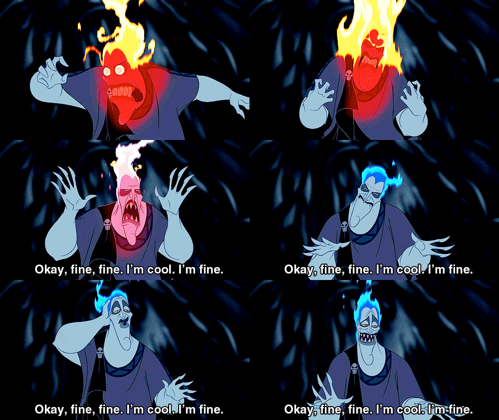
In general, I really love how the characters are designed all quite differently with tiny detailes that makes it a whole. While Hercules and Zeus are quite "angular" in design and build, Megara and Hades for example are quite the opposite, consisting of smooth lines and here and there the necessary spiked details. Because such big characters are so different in design with tiny details (like the swirls on joints such as kenes, or at the end of lines, in the hair etc) that try and make them fit together, to me it's already they "opposites attract" that is key in the design. Because they are so different in design to me, they complement each other when together in shot.


Getting back at puns, I really love all the mythical references the films tries to sneak into the script, all jokes I can greatly appreciate. As well, if you have knowledge of Ancient Greek Mythology, it's always fun to try and point out which character resembles who out of all the gods. Even though I'm not entirely fond of all the bright colours they used to perhaps tell all the different gods apart, it sure does its job. I wonder however how it could've been when they would've stuck to a smaller palette of colours and perhaps only use different "holy glows" to clarify who is godly and who is not.


Tarzan

Tarzan is the last film from the so called "Disney Renaissance", a period of 11 years in which Disney had a creative bursts with films that were received well by the public and critics.  

Tarzan is a gorgeous film put together with different techniques, which I didn't know about before. IT bursts with lots of different, very strong characters who all complement each other in a magnificent way. The animation is done gorgeous, while being distributed over two locations: LA and Paris. Tarzan was animated in Paris where Glen Keane partnered up with french animators with a background of excellent life drawing skills. Something that turned out to be quite required when working on a character with such a complex physique. He needs to look strong, without looking too buff. He's human but walks and acts like animals he's surrounded with, adapting to each animal respectively. And of course, he is 95% naked, which causes to give him an anatomically correct physique with correctly displayed muscles.


In Tarzan a lot of different emotions of love, friendship and curiosity come into play, which I think is brilliantly done. The characters each have very strong characteristics in their design, mainly their eyes. The eyes of all characters tell so much to me in this film and I'm not entirely sure why.  


A really important part of the film is the symbolism in the hands touching each other, especially those of Tarzan and Jane's. It became such an important symbol of the relationships between the characters in the film. It metaphors Tarzan's search for his own identity. All his life he's been made fun of for being different, desperately trying to fit in and get approval of Kerchak. Then he finds creatures who look different than all the ones he's been seeing in his life. When touching Jane's hand he first realises they're the same, which is a catalyst for the roller coaster of emotions Tarzan is going through afterwards. Upon realising who he is, he then starts looking for more answers, who is he really? Even though the gorillas are his family, he's technically not the same. A major thing they changed from the comics is the end. Initially Tarzan was to leave the jungle and go to England, but to strengthen the effect and the symbolism they put into family, they altered the story so he could stay. This way Jane could be part of his world emphasising the relationships.


A thing I never realised in all my years watching this film is that all of the backgrounds were technically 3D (to be honest, it's also been a while since I last watched it so I might've been able to notice it now?) They made use of new techniques within the 3D animation of Deep Canvas. This way they could make the paintings come to life, as if they would be walking and swinging around in a 2D environment. How it technically works is that they create a 3D environment, and they paint on the mesh, as if you would when painting on a canvas, and this way you can paint everywhere you'd ever dreamt of painting. Because the backgrounds and the characters always blended so smoothly I never noticed, or even thought of the idea that it could've been another medium.


To bring another emphasis on the whole "family" as a general theme in the film: When the animators went on safari in Kenya to observe the gorillas, they encountered a view they never expected to see. Instead of the ferocious animals they had expected to stumble upon, they saw a beautiful family of gorillas living together, caring and watching out for each other, just like you would see with humans. And this little piece of magic that is the animal kingdom always amazes me.


the Incredibles

There are a few things when they were creating the Incredibles that I think are really clever:
1. Working from Collages
2. Basic shapes to create the characters
3. Interesting silhouettes in design. 


When I went to the Pixar Expo in Amsterdam a year ago, I found out that the designers of the Incredibles worked a lot in collage techniques when creating lots and lots of characters for the film, especially when creating the superheroes' designs. They mostly worked with coloured panels or ripped pieces from magazines. The collages were inspired by the looks of posters from the 50's. When making these different kind of collages, you stumble upon designs or colour combinations you normally would not have thought of. What I really like about these designs and "posters" is that the creators added them in the film, one way or another, either it being the title or credit sequence, or through posters/comic book covers that are shown in the film.

When creating the family (and probably other heroes) they tried to incorporate their powers into their designs. Meaning they wanted to enhance the kind of power they have by the figure of the body. A few examples; Dash having the power of speed had to be tiny. Small legs to move fast. The combination of his slick haircut adds the sense of speed. Especially when you look at the shapes that combine his head: round shape for his general face and the triangle for his hair. (look at image for reference). Violet on the other hand has a timid personality, being very shy and wanting to be able to disappear. Whoa, she can for real! The timid posture she has in the beginning of the film and her skinny physique enhance her power of invisibility, with in contrast the power of creating a force field.
Robert Parr, Mr Incredible, has super strength, so his physique and design is quite obvious. Big guy, big shoulders and lots of muscle mass.


Pixar has a great sense for poses and silhouettes. When combining the two you can go far with your designs. One character that I used the hate when I was little but have come to love is Mirage. She is a clever piece of design. She has the ultra skinny body and the sly eyes, fitting here cunning personality she puts up in the beginning of the film, combined with her round face shape, which (when we look back at the image above) should generally suggest a person is friendly, trustworthy even perhaps. When the movie develops we get to see her true colours and realise she isn't that bad after all, probably caught up in an abusive relationship. The combination of here head and body is misleading, but works perfectly. Another character I adore is Edna. She is the epitome of what everybody needs to be. She is funny and quirky, but sure is stubborn as well. She has a tiny and square physique, making it more difficult to convey emotions, but here body language is everything. For such a small posture, she has great silhouettes when posed in the right way.


Not entirely sure how to feel about the possible sequel coming up though? I mean, this film was perf.


Monday, 19 January 2015

Planet 51

I remember watching Planet 51 a few years ago and thinking it was hilarious. I also thought it was probably full of cleverly placed references to alien films or happenings, which I don't know much about. I never really had that much for alien films before. Even though the ratings of this film are pretty low, (21% Rotten Tomatoes, 39% Metacritic) I still think the film is pretty clever. Sure, the plot was a bit predictable, but you don't often see such films through the eyes of the creatures on the other side.


The story basically consists of a recognisable plot line from the past few decennia: boy likes girl, she is sort of interested, but the mixed signals the clumsy boy releases are a bit off putting. Add some comic relief characters and lots of pop culture references and you've got yourself a film. Probably an easily forgettable film, but still a film. While "planet 51" occurs in the style of the 50's, and the human (for them alien) visitor is actually from the 21st century, a clash is created between the two worlds, which in turn ignites a comic reaction.

What I quite enjoy in "easy watch films" are references, and trying to find them all. First: the Rover Robor, reference the the Mars Rover and similar in design. Sending only pictures of rocks while a whole planet is at his feet (when he manages to escape that is. While imprisoned we see other appliances/satellites "captive" as well like Sputnik.) Other pop culture references are the bicycle from E.T., the housedog looking similar like the aliens in Aliens vs Predator and for example references made by the human character Chuck about Terminator and Star Wars. More recognisable things are the way the movies the aliens watch are similar to the alien films we produced years ago, comic book culture and even the portrayal of hippie culture (with the typical VW van. But without wheels, since all the vehicles hover. And it rains stone? Logical.)

So while the storyline was quite recognisable, recycled and predictable, it still makes it into an enjoyable film, but not necessarily a top notch film like we're used to from Pixar or Dreamworks. It's just that I have a soft spot for references and easter eggs which made this movie stand out a bit to me I guess.

Sunday, 18 January 2015

Mr. Hublot


I absolutely love this short. I already did some research on this short before last year, but I figured I could try again this time for this module.

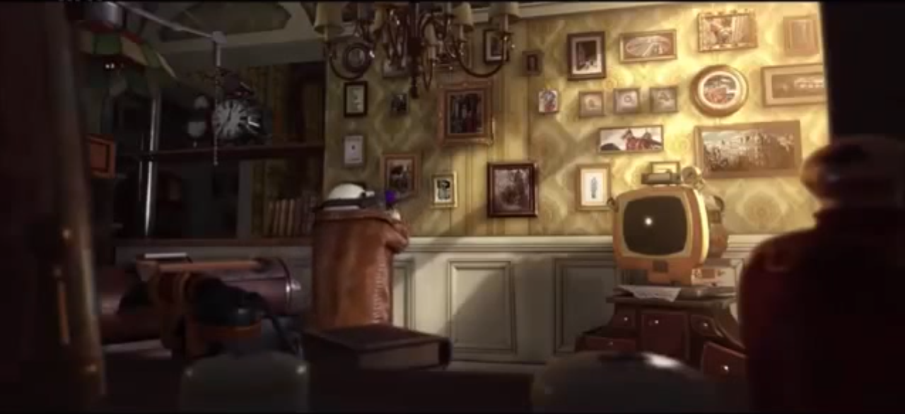
Mr. Hublot is a lovely executed 3D animated short. The character design is a lot in correspondence with the design of the surroundings.

The short begins with an introduction to mr. Hublot, his surroundings remind me of the 50ies mixed with a modern, steampunk like touch. He performs a series of actions which lead me to the conclusion that he deals with a form of OCD. When he exits his house he sees that the big building opposite his house is for sale, down in the street is a lot of traffic. His attention is grasped by a small robot-like dog. He then enters his house again and get a time lapse of the night.


In the morning he follows a ritual that is very time-bound: stirring his coffee for a certain amount of time, hitting the edge of the cup with his spoon for a certain duration, until he gets distracted of the happenings outside. He again focuses on the dog. Lost in thought, he "awakens" again when the bell in his clock tolls. In a hurry he continues with his rituals. In the meantime we see that the dog is having a rough time. (haha, rough, ruff. Okay joke time over.)


When he wakes up the next day because of a lot of noise, he sees that the box the dog was sleeping in is slowly disappearing in the garbage truck. Because having grown a fondness of the dog, he hurries outside to try and help the dog. Thinking the dog is gone, he is surprised when the dog is suddenly sitting next to him. He takes the dog in, takes care of him and the dog keeps growing and growing. Suddenly the dog becomes too big for the tiny home. Because his rituals are disrupted, mr. Hublot slowly starts "to lose his mind", and it seems like he wants to take apart the dog out of frustration.

In the next shot we see him performing his daily rituals in peace. It turns out he bought the big building that was for sale in the beginning, so he could live together with the dog, without having to care about the house falling apart.


The combination of the designs of both the characters and the surroundings, plays a significant role in the way the story is told. While Mr. Hublot's design is quite simple, he has a lot of details in his accessories. The way he interacts with his surroundings gives away a lot of his personality and his surroundings have an effect on him as well. As his easy living life gets disturbed by the dog growing and growing, it has an effect on mr. Hublot and this is visible by his design: the meters on his head go on and on until they reach a maximum. I think this was very cleverly done in the design department, how to make clear through their design how a character is feeling. All the meters and other appliances that are part of his attire react on his surroundings and his behaviour and are sort of a translation of his feelings.


I really loved how the animators played with the design here, on how it's more than just a part of someones attire, but an extension of their personality. Even for the dog, to visualise him as a stray dog they used scrap metal in his design. Clever details like these make such a short film very interesting. I also think there's room for such details because it's such a short film.