Wednesday 24 December 2014

Responsive brief 2. Attempt at 11Secondclub

This was my first time "participating" in the contest for 11SecondClub.

Briefly, the concept of 11SecondClub is to animate a lipsync with a technique of choice within a month to the selected audio file which is, of course 11 seconds long. Most of the entries are created with a 3D animation technique for the resources are quite easy and it's more doable to animate (with an already existing rig) within a month. If you don't have a working rig of your own, there are resources available online to use pre made rigs that are free to download. 
After the month is finished, members have the opportunity of five days to vote for all the entries. The voting system consists of a star system from 1 to 11. (With 1 star being really bad and 11 being outstanding.) After the five days of voting are over the winner gets selected and a small price will be received. This price is getting feedback/critique from a professional animator 


Since this is a competition that is pretty straight forward, there is no need to research any briefs that are associated with the competition. (I also started this way before we had discussed all that too.)

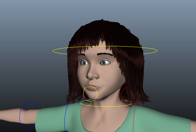
I started off with listening the audio file loads of times. I wanted to start with blocking all the movements first before I would start on the lipsync. While I was listening I tried acting out different movements to see which would fit the chosen character (downloaded from the internet) and the audio the best. Then I put the key poses together with the key words, a bit like a storyboard.


I started with the animation in a blocking manner, making all the keys in a "stepped" form. This way it's easier to see if the timing of the poses is right. Afterwards when splining the keys, there's room to change up the timing of some minor movements to make it a bit more realistic, but the main movements are then set to the certain timing I prefer. Down below are some screenshots of how the graph editor looks and the scene in Maya itself. As you can see, all lines of the keys are in a stepped manner, so when playing the animation, it'll play movement to movement. When I was content with the blocking of the animation I moved on to splines.


To spline the keys, I just have to select them all (when all the animation controls are selected) and select "spline". There will form a smooth line connecting all the dots. Sometimes the lines will go over a certain threshold (like feet going through the floor), so certain keys have to get edited to flatten them out. This will lock the feet for example in place. 
I thought, since I didn't have too much movement goin on in these 11 seconds, just the default spline with some flattening here and there, fit my wishes, so in fact I would be able to move on to the lip sync part of the animation.


HOWEVER. Because Bradford Animation Festival took up way more time than I had anticipated, I only got around finishing the blocking/splining part of the animation in time. Which means that I couldn't send in my entry for the competition. A way to tackle this for a next time is to set different moments before hand, to REALLY work on this short animation (since it doesn't have to take too much time to do, here and there an hour and you could get a lot of work done in between working on other assignments) to get around finishing it earlier so I would be able to send it in.
At least I was able to practice on animating a full body before I would start on my own animation for Character & Narrative, which is really nice as well.

Saturday 20 December 2014

Where my keys at?

Today I finished blocking the animation for the movements of my model. At least I think I did. I broke down the lyrics into various section, animating section by section by moving on when I thought the section looked alright. Every time when I added a new section I would playblast a simple "splined" animation of the blocking to check if the timing in spline was also alright.
Then I went back to previous sections to tweak a bit to continue on the next section.

I animated after my storyboard and newly filmed reference footage I filmed a few weeks back in my dorm. Comparing the reference with the storyboard and working from that was quite a good way to keep all the movements clear. While acting some movements out, I figured they wouldn't work quite as well in animation for the movements would be too minimalistic. So while animating I tried to alternate exaggerating movements with minimalistic ones to keep a bit of a balance. I also found out some movements I had in mind while animating were a bit too fast when I splined them, so I had to find a way to tone those down a bit to make it look a bit more calm. (still working on that).

This is the first time for me to try and animate something scripted in Maya and so far, it isn't too bad. And so far the rig has't acted up yet anymore, so that is nice! (still a bit anxious for the lipsync part though. I will first practice the lipsync while using the audio fragment from 11secondclub and I will cry when it looks terrible, but I don't really have a choice afterwards so I better make it work then. But we'll see soon enough.)


(I just found out this one has no audio. my bad. And also that the ending looks horrible. but I'm going to work on that tomorrow.)


My plan of work from now on is alternate the workload of Character and Narrative and Responsive, but concerning this module: I'm going to spline and tweak the hell out of it to finish up the animation to make it ready for lipsyncing and I'm going to break down the lipsync using the simplified dope sheet we were provided earlier. When that's finished I can just pop 'em into Maya (I hope). I also have to add some lights to the scene to make it a bit more exciting.


Monday 15 December 2014

Studio I like 3: Shosho

Another studio I tried to contact is Shosho, located in Amsterdam and Rotterdam.
Shosho is a studio with different disciplines: Film, VFX, animation, design and interaction. In Amsterdam the main focus lies with film, animation, VFX and interaction, while in Rotterdam it's design and motion-graphics for film and television

The offer a varied set of services for companies interested to hire them:

  • VFX for film, TV and commercials
  • Animation in 2D and 3D
  • Motion-graphics for leaders, title sequences and corporate films
  • Illustration and character design
  • Graphic design, film posters and illustration
  • Films combining all of the above
  • Development of interactive projects.
When looking at their site the first time, the thing that struck me was the video for Philips Senseo they put up on their homepage. I wish I could embed the video in here but I can't because of its privacy settings. 

I really love how the studio provides such a wide range of services, this way there's a great change you'll be in contact with people from different disciplines while working on certain projects.

the hair experience and blendshapes

Blendshapes

First I'll start with the blendshapes. This was quite the experience. I only made a few blendshapes when creating my last model since I didn't use it to animate much, but only 15 seconds or so of my storyboard, so only a few expressions were necessary like blinking, simple eyebrow movement, nose wrinkling and moving the lips either a bit up or down. 

This time was on another scale that's on a whole other level! To make it easier for myself I started with the simple blendshapes first: Eyelids and eyebrows movements. I created blinks for the upper lids and slight movement for the lower lids like squinting. For the eyebrows I made six blendshapes for each eyebrow, an upwards and downwards direction for three locations on each eyebrow; inner, middle and outer. The I moved on to making the nose wrinkle and the cheeks puff out and suck in. (You'll never know when this will be useful!) I then decided to make the easier blendshapes for the mouth first: some expressions! A smile, frown, pout movement for each side, and a full upwards and downwards motion of the lips (You never know). Then came the difficult part for me: Phonemes and more lip movement. I wanted to create a similar facial control panel like with Mery, but since I don't know how they put it together, I used my own interpretation. I tried to make a few upwards and downwards motions for the upper and lower lips, as well as some sidewards directions. I hope I can make the mouth take certain shapes to make the phonemes look different each time (so it won't be like copy and paste the phoneme) After I was done with that I made a blendshape for each phoneme to (hopefully) make the animating process of the lipsync a bit easier.

The first blendshapes: eyelid and brow movement 
My army!

Animation panel of the facial expressions 
Turn that frown upside down!
I then added the blendshapes to the original mesh. And I was thinking I was being so smart by adding them grouped to the different parts of the face: eyes, eyebrows, lips, phonemes. Oh boy was I wrong. Sure, the blendshapes were working fine, but then I found out (AFTER HAVING SET ALL THE DRIVEN KEYS TO THE CONTROLS) that the groups override each other, so that was a thing. I then had to delete all the blendshapes and bind them with the mesh again, this time all at the same time, and then I had to set the keys again. I was a bit lucky though since I had put restrictions on the control, so I didn't have to be too precise, but just whacking the controls up and down and set the keys.


But that hair though

(hair though, hairdo, gettit? Sounds nearly the same! ahhh terrible joke is terrible.)
I asked Mat for some assistance and explanation on the hair. At first we wanted to look at nHair, but for some reason it wasn't working. The clumps kept being located funny and the scalp wasn't filled with hair. Again and again. After a few curses here and there we decided to give up and try xGen hair instead. Since Mat doesn't have too much experience with this yet, I tried to figure it out myself by looking at a few different tutorials uploaded on digital tutors and the official Maya youtube channel.
I got an idea on how to make it work and so I decided to try something out.


At least I got hair now! I settled with this but I still wasn't too satisfied with it. The hair didn't seem to respond too well to the curves used for xGen and I couldn't get rid of some weird bald spots for it still cut through the mesh. A LOT. You could even see strands of hair coming far down the mesh in the mouth when I would open it. Not too charming. I then made an extra copy for backup and deleted all the xGen files and tried to give nHair another shot.

This time I looked for a short autodesk tutorial on their helpdesk website (to where you get directed when pressing F1). I saw they used a woman with long hair as an example and showed how I could achieve a bit of a hairstyle, so I decided to try that. I selected the scalp, added lots and lots of clumps of hair, deleting them each time until I thought I had the right amount. Since my laptop isn't the greatest when it has too think a lot, it took quite some time before the hair found a good resting position. I then could select the curves, make it able to select the vertices of the curves and cut a few of them away to create some kind of fringe. I then tried to add a bit of a curl to the bottom of the hairs (Which gravity in Maya will probably pull down, but at least the shape will stick a bit!)

Hair!
Since I couldn't add high resolution uvmaps to the mesh without Maya fucking up and all, I couldn't paint them own (looks stupid as well though.) So I tried to make them using curves. Even though my French is terrible, I was able to follow some French guy's tutorial on how to create them using curves. I created a set of curves, duplicated them to double it up, and then duplicated them to the other side of the face as well. Add some hair to them and voila: something that somewhat resembles eyebrows!


I asked Mat for help on how to make em stick to the face. Since curves can't constraint with polygons, I had to create a lattice. This is kind of a box in which the selected objects reside and when you change the lattice, you'll deform said objects. The thing with the lattice is: I can constraint them to the head joint now! They weren't changing with the mesh now though. For this I selected corners of the segments of the lattice and created three clusters (one for each part of the eyebrow that moves). These clusters I then moved up and down (and some rotation as well) and used driven keys to make them move with the mesh when the controls move. So that sort of worked quite well. Thanks Mat! 


Sunday 14 December 2014

Responsive session 11 december

This session we had to prepare our first take on the presentation boards. The ideas was that we had to present our proposals and ideas in front of your own group and ask for feedback on how to improve for next session after Christmas break.

Here below are my presentation boards.


What I mainly wanted to show on my boards are the things I aimed to create in the amount of time given, and in what context said creations can be displayed. I made some rough storyboards that illustrate my take on the designs of the packaging. I tried to give the different flavours a bit of a background story, how they could've been created. I wanted to use the same style they use for the packaging to make sure they're in unison. I thought the aesthetics of the packaging used in  a commercial for example, would make the ad lighthearted and would hopefully bring a bit of joy.

I tried to look for different options the ads can be displayed. The first thing we think about is on television, but since this is quite a young company, they might not have enough money for that, or wouldn't like to spend that amount of money. Other options are are ads to be played before videos on youtube, ads that play muted besides content on different kinds of websites, or simplified versions of the "full ad" to be altered to fit the horizontal or vertical bars on websites. Another option on the internet might be sponsored messages on social media feeds like facebook.

The discussions:

As usual, we had to make lists this session.
This time it was a list on what feedback do I want/need?
We put together this list:
  • Contextual feedback
  • Are you well informed?
  • Is the structure clear?
  • Is it a realistic/achievable goal I have set?
  • Research?
  • Context is key: does it work?
  • Does it look good? Aesthetically pleasing
Together with the whole class we put this list together:
  • Does my idea/proposal communicate the appropriate concept.
  • Does the pitch meet the specs of the brief?
  • Do the boards communicate the proposal effectively?
  • Is the response suitable for the audience?
  • Is the choice/use of media appropriate?
  • Is the response achievable in the time available?
  • Is the response appropriate to an identified context?
  • Is the visual concept/direction appropriate to the tone?
  • Do the deliverables meet the mandatory requirements?
  • How can the response be improved?
After shortly pitching my boards I first already got this feedback:
What colours do I want to use? The original colours might be a bit bright and loud in your face, maybe use some alterations to make it still fit with the original, but also a bit more exiting. 
How is all the formal stuff placed in the ad? Voice over to make clear what the product is about?
How will the endscreen look like, where is it available, what more is important to add?
Maybe an idea to try and animate (a bit of) one? To see how the aesthetics will be.
Create moving storyboards based on this feedback. 
Proud to mention the girls found them clear and fun.

Below I will list the progress reviews I got.

Strengths
  • The concept is great, charming narrative behind each story/animation
  • I've though about how i can incorporate the pre existing visual aesthetic of Propercorn
  • Simple but very effective ideas. Love the chive one: perfect for short but professional advert.
  • Insight into the journey/life behind Propercorn
  • Very neatly and well presented boards: clear!
  • Animation ideas are playful and good: sparks interest, put in a different light
  • Animation is all aesthetically well tied into their current image: so it's relevant

Ideas for improvement

  • Is there a way I can include/communicate the "care" or "time and dedication" that goes into the production of Propercorn, as the slogan "Propercorn, done properly" implies?
  • Propose a colour scheme, try colours that work well with the animations as well as the colours they have on their products (if they haven't specified ones)
  • Experiment with textures
  • Perhaps try to make e.g. the designs for the web banners even more
  • Create 1 original/different, that way it will make the work more original to me

Questions

  • How long is each commercial?
  • Can Propercorn afford tv advertising? if not, in what alternative context could this exist? Their website?
  • Can I produce on animation to submit?
  • What sound will I include? Voice over, male/female, background sounds (e.g. the chopping of the knife)
  • Who are my audience, when do they watch tv? what is the prime time to air the commercial?
  • What exactly am I trying to communicate?
  • Could I use for other examples for the contextual research?
  • Will I have to include any logos and information etc?

Furthermore we put a list of expectations together with the class to finish the session:
  • More resolved visual concepts
  • More appropriate/considered visual aesthetic
  • More professional/clearer presentation
  • Clear timescales and deadlines
  • Refined brief (including specific audience)
  • Production tests
  • More work
  • Mock ups
  • Contextualisations
  • Existing Feedback & confirmed decisions to direct feedback.

Friday 12 December 2014

Study task 4 and 5 - lip sync practice

For study task four and five we had to choose a sound fragment, gathered by Mat. That fragment we then had to dissect and fill in a dope sheet. A dope sheet is a way to schematically write down what is going to happen at what frame, and how long that action will take. Usually dope sheets are way more difficult, but we got a simplified version since we only had to worry about the lip sync.


At first the dope sheet didn't look like this. It was scattered around on a few pages of a note bloc, probably in the bin now. Or even already recycled. Heh. Alright. I had quite a hard time trying to fit all the sounds into a rate of 12 frames a second because a lot of the sounds only hold for 1 frame. When actions last for such a short time I feel like it will go too fast. (That's why when I tried to animate my first lipsync which I started roughly a year ago, I tried to animate it in 2D on 24 frames per second. Real regrets here. It's still not finished

A few tips I gathered over the time I'm studying I wanted to keep in mind while working on this task: never literally animate all the sounds that are in a word because you don't actually hear them. The way we move our mouths while talking is a smooth transition of movements, so you must try to convey such an illusion. Another tip I got is to never open a mouth twice on a word. Which is quite restricting. I reckon it depends on the words you're using, but on a regular basis you never fully close your lips while talking, so I'm guessing it refers to that.


I first wanted to not do more than necessary, i.e. only make the mouth move. It's what's in the task and I felt I already had enough stuff to do, I would only be wasting time doing too much work. While animating I already soon realised I was moving too much. It felt like the jaw was bobbing to much and way too fast. So I had to cut quite some movements to make the mouth move smoothly to the audio. After I finished it still felt a bit awkward. A bit too static. So then I decided in the end to add more movements to bring it a bit more to life.


I also exaggerated a few of the movements in the mouth by opening it a bit more here and there and tweaking some areas of the lips. I didn't give the animation of the head/eyes too much attention, but I feel with the animation it feels a bit more natural right now. The head tilt forwards near the end still feels a bit awkward but I couldn't really be bothered to change it right now for I feel I should give the main project more focus right now. I still want to try and animate another lipsync (probably 11secondclub from december. In november I put my main attention on practicing blocking poses and such. Because of BAF I didn't come around to animate a lip sync so in the end I didn't send it in. I'm not sure if I will participate in the december one as well for it'll probably be just a practice, but I'll see how it goes.)


Sunday 7 December 2014

Prop 3 - Alarm clock

I looked for a few references again, before choosing the retro red/green one as inspiration for the alarm clock. I liked this one because I thought it would be easy to create, and still be recognisable as an alarm clock.


I started off with a cube, adding divisions and later on bevelled the edges on the sides. This was going to be the base. I duplicated the base, scaled it down over one axis and extruded the centre inwards to create the indent of the alarm. This was going to be the part with the numerals on it. The part I extruded inwards, I later then duplicated again for the piece of plastic/glass what is in front of the numeral plate. I added two cilinders. One at the top, probably the snooze button, and one in front at the centre of the numerals. This is the cilinder on where the arrows are attached. I created an arrow from a panel, duplicated this one and altered it a bit to make it look a bit different, to differentiate the short from the big one. 

For shading and textures I used mia materials for the plastic casing of the alarm and lambert for the plastic for the numerals and the rest (the cilinders and arrows). I then had to create UVmaps for the arrows and the numeral plate, coloured them using photoshop and later added them to the textures.


For now I just leave the alarm for what it is, but if I would want to animate it later on if I have the time, then I could. The arrows have their pivots centred on the cilinder, so I can easily let them rotate if I wanted to.

Final prop: fertig. Ready to add them into the scene.


Prop 2 Dresser

Just like when creating the bed for the setting, which requires a sort of dresser, I went looking for some inspiration and reference. I tried looking for some different styles of dressers, but felt like something simple fit the scene the best. 


I forgot to take screenshots while creating the prop since it went really fast, I only have pictures when I finished modelling it. The dresser mainly consists of square plates and a four poles. I didn't bother with creating actual drawers, since I won't be opening any of them. The purpose of the dresser is adding something more to the scene, and something to place the alarm clock on (since the alarm clock is a "vital" prop for the animation.

For texturing, I tried fiddling a bit with some of the wooden 2D textures, but it was mainly just grainy and circles cut in half for some reason. So I stuck with a basic creme colour for the wood in Lambert, and a simple grey anisotropic for the handles to mimic the metal.

The dresser was a whole lot easier to create than the bed since I didn't have to create anything "soft looking" like the pillows and the duvet.


Prop two, finito.


Thursday 4 December 2014

BAF17 - Overall thoughts

Overall I'm really glad I went to the festival, even though it was quite draining for me. When I went to Stuttgart this year I already thought it was pretty exhausting and that was 3.5, so five days was a bit madness! Because I have a really bad sleeping pattern and a shortage of sleep because of that, I dozed off quite some times during events, which I'm really ashamed about.

A good thing: I stepped a bit above myself and spoke to some of the speakers, a thing I never really did because I was scared. During the small set "meet the speakers" I came up to them afterwards to ask to take pictures. It's not much, but it's a big thing for me to just walk up to these big figures, almost 'heroes', and flat out ask them for a photo, so that was a nice first step. Then I stepped up a bit more and asked a question during a big talk in the big lecture hall. My heart beating in my throat I managed to ask the question decently. I was always afraid to ask questions in big settings like this, first because I'm afraid I'll mess up (especially if it's an unknown setting in a different language. I have no difficulty talking up in a big lecture hall during a lecture while being with people I know though), or because I'm afraid to look like a fool.

I know there are also lots of people, newer to this world than I am who talk to these people, just like that. I'm really envious of those, but these two steps I took during this week are not just steps to me, they're leaps. So I hope in future events like this I'll be able to push myself even further. This world is all about presenting yourself, sitting quiet in the background won't get you far.

Aside of me stepping out of my comfort zone, it was a pretty enjoyable week. I've seen lots of shorts for the second time (that's what you get for going to multiple festivals, but that's a good thing, right?) but also many new ones. It was really nice to see what's all out there.

My main things for a next festival or event like this are to get some proper sleep so I'll be awake through it all, and to step out of my comfort zone more and more, talk to people!

BAF16 - Double Negative

Chris McLaughlin, a sequence supervisor from Double Negative, came to talk about the special effects of Hercules, mainly about the creature development for Hercules. He first showed the Showreel (which was uh-mazing by the way) before starting to talk about the process.

For Hercules Double Negative had to create environment extensions, digidoubles, crowds and five creatures. Each his own mini sequence and their own environments. The creatures were the  Erumenthian Boar, Lernaean Hydra, Nemean Lion, Cerberus and the three wolves. They were provided with some material; concept art, sculpt references, Cerberus previs (provided by "the Third Floor", which was shown.) They realised they had a few challenges ahead: hair and fur, a lot of it and many close ups. Creature in the water, interaction with actors and snow. The RND team created a groom tool Furball, a GPU based procedural node based tool, to help themselves when creating the fur. They created fur simulations, v5 physical plausible shading, Fluid simulations and a crowd rioting.

A great piece of advice you'll hear everywhere: Reference is the most important in VFX


Each creature had the same kind of pipeline: the model, displacement, texture base, details and shading. When creating the creatures, they started off from the sculptures they were provided, and altered them in a manner that they fit better with the visuals they wanted to create. Then they added lots of different maps on top of it. Displacement maps add ton of details and realism with not too much effort. For the fur of the lion they used multiple shaders with different tones to achieve a realistic effect for animals never consist of the same colour over the body.

They also used a lot of digidoubles or pieces of it for Hercules for the live acting didn't fit the sequence. They used the doubles for both far and close up shots. The digidoubles (also others than just Hercules) were useful for things like costume variation, for they were easy to add in. Key thing with acting when you know you'll add a digidouble is to use contraptions while shooting a scene. The contraptions add weight to the acting. Instead of acting to hold on to the jaws of a wolf, act while holding on to a contraption which you can edit out later and add the CG on top.

To try and achieve more "realisticness" in the creatures they used a normal rig with volume joints. This way, when they move, the amount of volume stays the same. Instead of just folding in when moving a joint, the volume gets displaced to achieve a more realistic feel. The first thing to do with the creatures is to create walk and run cycles to see if the volume distribution is allright. Then the muscle mesh is attached to the rig with a skin mesh wrapper around it. This creates the illusion that the skin is gliding on top of the muscles, just like it would do in real life.

Pipelines of two sequences:

The hydra sequence:
Key the blue screen
Environment extension
Add the hydra
Add water fluids
Add water on Hercules (no digidouble, on top of the actor)
Extend camera movements for more drama.

The boar sequence:
Real life footage
Blow up a tree for reference
Add the boar
Environment extension (or entirely CG)
Add CG Hercules
Add snow interaction.


It was really nice to see how VFX really work and it was an eyeopener for me. I must say I opened up my mind a bit more towards visual effects. I was always really envious of people who were really good in creating VFX, and I have much respect, but I never thought I would be interesting in doing them myself because I always thought of myself as a character kind of girl. Well done Chris, you caught my attention.

BAF15 - Panorama 2

Lots of stop motion in this collection of shorts.


Seafront, directed by Claire Lamond, stop motion.
It starts with a couple who are musicians, playing in a tavern or something of the same sorts. The man has to leave for World War 1. We hear his letters directed to his love accompanied with visuals of her and their son trying to get through the day, connected with each other through the sea. A recurring object is a seashell, the shells are a symbol for their connection but leaves him upon his return with bad flashbacks for the sound reminds him of the horrors of the trenches. For they are together again they face the shells down in the sand.
Even though the story was quite interesting, I didn't feel like the short altogether was very captivating for the voiceovers were pretty awkward in combination with the animation. The style also seemed a bit rough to me so it wasn't very inviting.


Interview, directed by Mikkel Okholm, 3D animation.
Interview was a really funny and clever piece of animation. The short is set in a boring, pretty empty room except for a few chairs and a table. A guy is there for a job interview without knowing what job he is applying for. (Even though it's the most important job of all time, he only doesn't know it yet!) The man enters with good intentions but is quite confused with the sudden appearing and disappearing of his interviewers, who also seem to ask quite strange questions. Even though failing the interview in the first place he gets the job anyway since he's the only applicant left. Congratulations, you are now Adam.
The short was cleverly constructed and had funny segways and transitions between shots. Cheekily placed references which only make sense after the short has finished, really added up to the short. At the start of the film it seems like a regular job interview with a slightly off side to it, filling all the plotholes when it's finished. The play with environment and locations made it all feel even more weird, for we don't exactly know what's going on. I found this short very funny for it's made in a pleasing style and has my kind of humour. (I must say, my taste can be quite terrible for I like horrible jokes as well, but this one was brilliant)


Wednesday 3 December 2014

BAF14 - Watch_Dogs


I made really little notes on this talk, but because I really enjoyed it (until I fell asleep from exhaustion) I want to talk at least a bit about it. What really touched me was the enthusiasm of the guy, Colin Graham, talking. He spoke in such a manner that he wanted to keep doing this for ever and ever, in the meantime grabbing each and everyone of us by our collars to go on this wonderful journey with him.

He spoke about this new game Watch_Dogs, which uses a slightly different approach to gaming than usual. The games asks you to use a smart phone for real life hacking in the game, which is a 3rd person shooter set in Chicago. This "NewGen" in gaming asked a lot of stuff from animation, so what does it mean? Over the years, game consoles progressed a shit ton on the area of memory. Even between the two latest models there's a significant difference. While the PS3 and XBOX 360 both had about 20-40 MB of animation render memory, the PS4 and XBOX ONE have 150-200 MB of memory. This huge difference in memory made it possible to add whole lot of new features to improve on the animation in the game. (Since animation compressing equals "poopoo filter", MEMORY MATTERS PEOPLE!)

Why does memory matter?
More memory means more space for variety in animation and less compression which requires better animation. Is your pipeline ready to double, triple or quadruple?

For Watch_Dogs they used a lot of real life footage through Motion Capture for the animation. Because of the better memory it's possible to use more different movements, differentiating styles and personalities. Even though MoCap still has its limitations (no minor movements like fingers and subtle details), it's a nifty piece of technology which helps out a lot animating simple movements like walking, running, jumping etc.

I like gaming and I absolutely adore games created by Ubisoft. Not because I love playing their games, but because their games look really gorgeous. Especially nowadays because of the growing technology and the growth in memory they are able to make it all look so beautiful and realistic. Of course the animation quality will look different in the gameplay than in the promotional posters, but it's still incredible how we are able nowadays to make it look like this when ten years ago we tried to use as less polygons as possible otherwise the game would crash.

Watch_Dogs 2014
Assassin's Creed 2013
Half-life 2 2004
Another comparison: Tomb Raider
Lara Croft in Tomb Raider 3 for Playstation 1998
Lara Croft in Lara Croft and the Temple of Osiris 2014
While the picture used for the Temple of osiris is a conceptual render and not the version used in the game itself, it still shows a lot of progression made on the field of creating characters in 3D.

 Going back to Watch_Dogs, I want to share a funny thing he shared with us about animating the character. The main in the game, when walking leisurely, has his hands in the pockets of his overcoat. To have his hands in the pockets without them sticking through the fabric, they scaled down his fingers, leaving the hand like a stump. To quote Colin: ICONIC!